Digipak Analysis
Taylor Swift - 1989

1989 is Taylor Swift’s fifth studio album and it was released on October 27th 2014 through big machine records. The album is named after Taylor’s year of birth as well as the pop scene throughout the 1980s.
The front
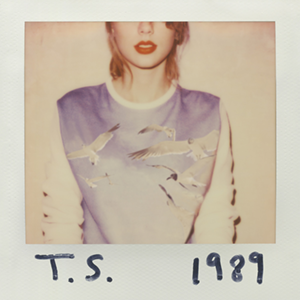
The front cover on the digipak shows a polaroid photograph which features half of Taylor herself as well as some writing on top of the edge of the polaroid which has her initials and the album title. Taylor doesn't need to appear in her album covers due to the fact she already has an established fan base who would be able to identify if an album is hers or not. The fact that she doesn't fully feature on the album cover is not a typical convention of the pop genre and is more a convention of the indie genre.
The polaroid photo is relatively old fashioned; this could be done to represent Swift’s time in the music industry.
The title of the album ‘1989’ was chosen because it was her year of birth; this also makes the album feel more personal because the date is specific to the artist. The title of the album is also very short which helps to make is easy to remember so that people can spread the word about it.
The colours of the front cover are quite warm and soft which has connotations of positivity; this could be to reflect the general mood of the songs on her album. In the image, Swift is shown wearing red lipstick. This is one of her signature looks which she has become well known for amongst her fan base and society; she even refers to her iconic look in some of her song lyrics.
Also in this image Taylor is shown wearing a jumper which has birds flying on it. This could potentially be symbolic of how she now feels that she is creatively free in terms of her music and no longer feels trapped to one specific genre.
The colour of Swift’s jumper and the background of the image are very similar, which means that they sort of blend together. This could be to represent how the album is personal and important to her.
The album title has been hand written in what appears to be a black marker. The fact that the title has been handwritten makes Taylor seem like an authentic person which positions the audience to like her.
The Back
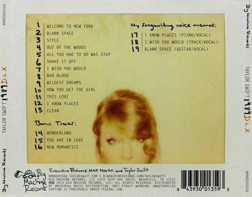
The polaroid photo has again been used on the back of the album digipak. On this part of the digipak, Taylor’s head/face can be seen this therefore links to the front cover; as the front cover shows Taylor from the mouth down.
The back cover shows the tracks on the album, the bonus tracks, Swift’s song writing memos as well as the barcode and record label information.
Once again handwriting has been used, this creates continuity between the covers. The handwriting has been used on the track numbers, sub-headings and for the logo of Big Machine Records. The logo has been changed from the original logo and has instead been made into almost a doodle; this ties into the use of the hand writing which ones again creates continuity on the cover.
The font that has been used for the song titles as well as the record label information is reminiscent of the font that a type writer uses. This and the fact the image is a polaroid photo links to the idea of old technology which gives the album a vintage vibe.
The image on the back cover is a continuation of the image on the front cover, it shows the rest of Swift’s face.
Inside the Digipak
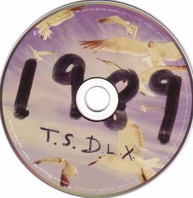
The CD for this digipak follows the same theme as both the front cover and back cover; this follows the typical conventions of a digipak. Taylor Swift does not appear on the CD itself, instead the CD has the same design on it as the jumper that she is wearing on the front cover of the digipak.
It shows flying birds which reinforces the idea of her creative freedom with this album. The same front and handwriting has been used on the CD as the front cover and the back cover; this continues to give the album a personal feel because it’s as if she wrote on the CD herself.
Around the edge of the CD is some information about the copy right of the album; this is a common convention of digipak.
The style is consistent on the CD because it has the same colour scheme as the rest of the digipak and therefore portrays the same vintage vibe.
Inside the Digipak
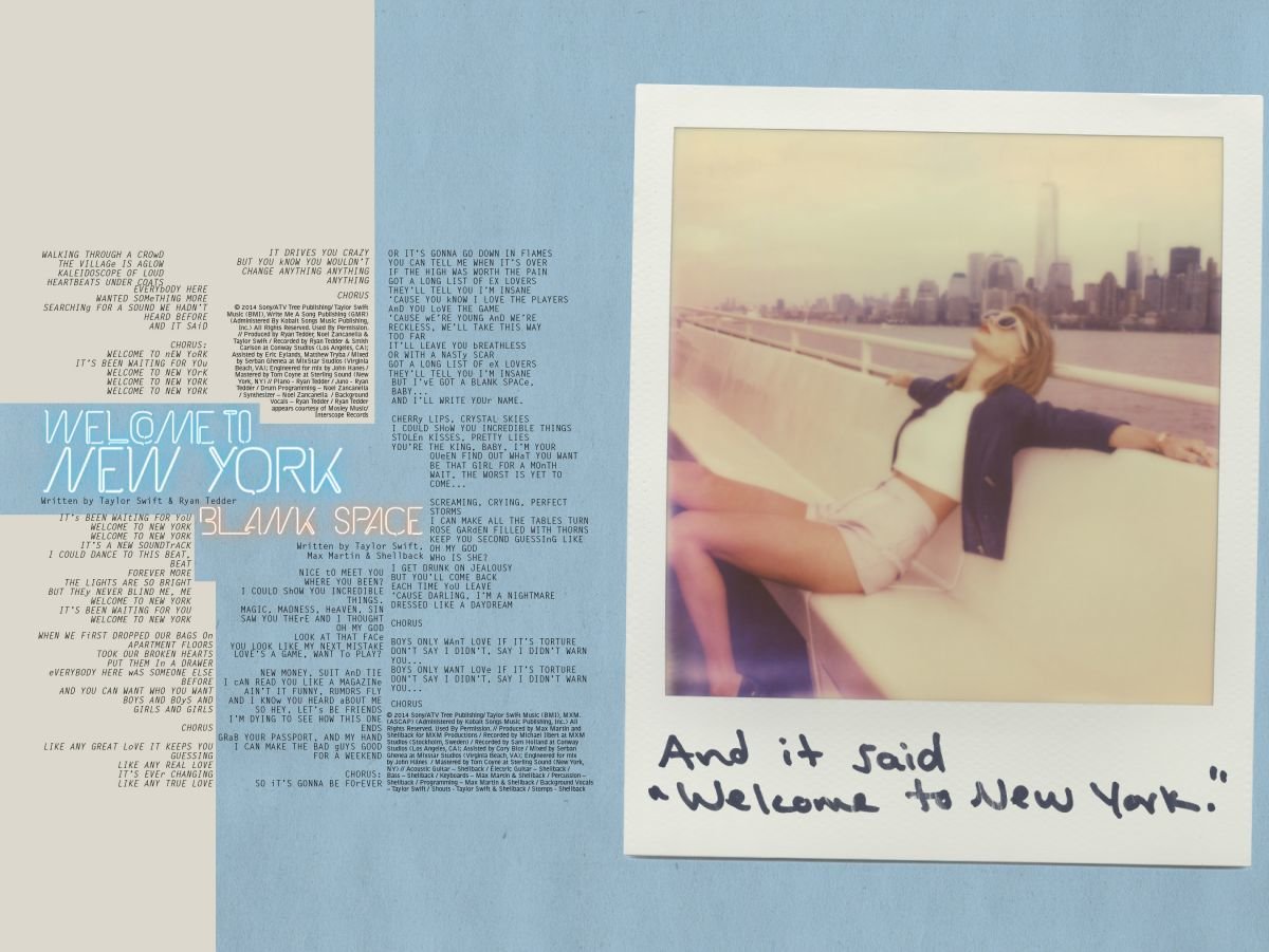
Inside digipak there are 13 collectible polaroid photographs. Taylor features in all of the polaroid images and some of the happen to be very similar to the picture on the digipak front cover. This suggests that these photographs were all taken as part of the digipak photoshoot and these were the ones that didn't make the cover. Along the bottom of the polaroid, there are handwritten lyrics from the songs on the album.
Inside the digipak there is also a book which has more of the song lyrics within it. It also features more polaroid photographs which are printed onto every other page of the booklet . Once again they continue to all feature Taylor in them by herself as well as having some lyrics from the songs written on the bottom of them. In this booklet there are also acknowledgements and thank you's towards the end.
Text
This was an advertised free gift, only available in the physical copies of the album makes the audience more likely to want to buy this copy because they get an exclusive, collectable gift.
The fact they are hand written continues to make the album feel more personal. These images create a sense of continuity throughout the whole of the digipak because they are similar in style and tone to the images used on the front and back covers.
deck
By ramsha