CSS Layout
Text
The Box Model
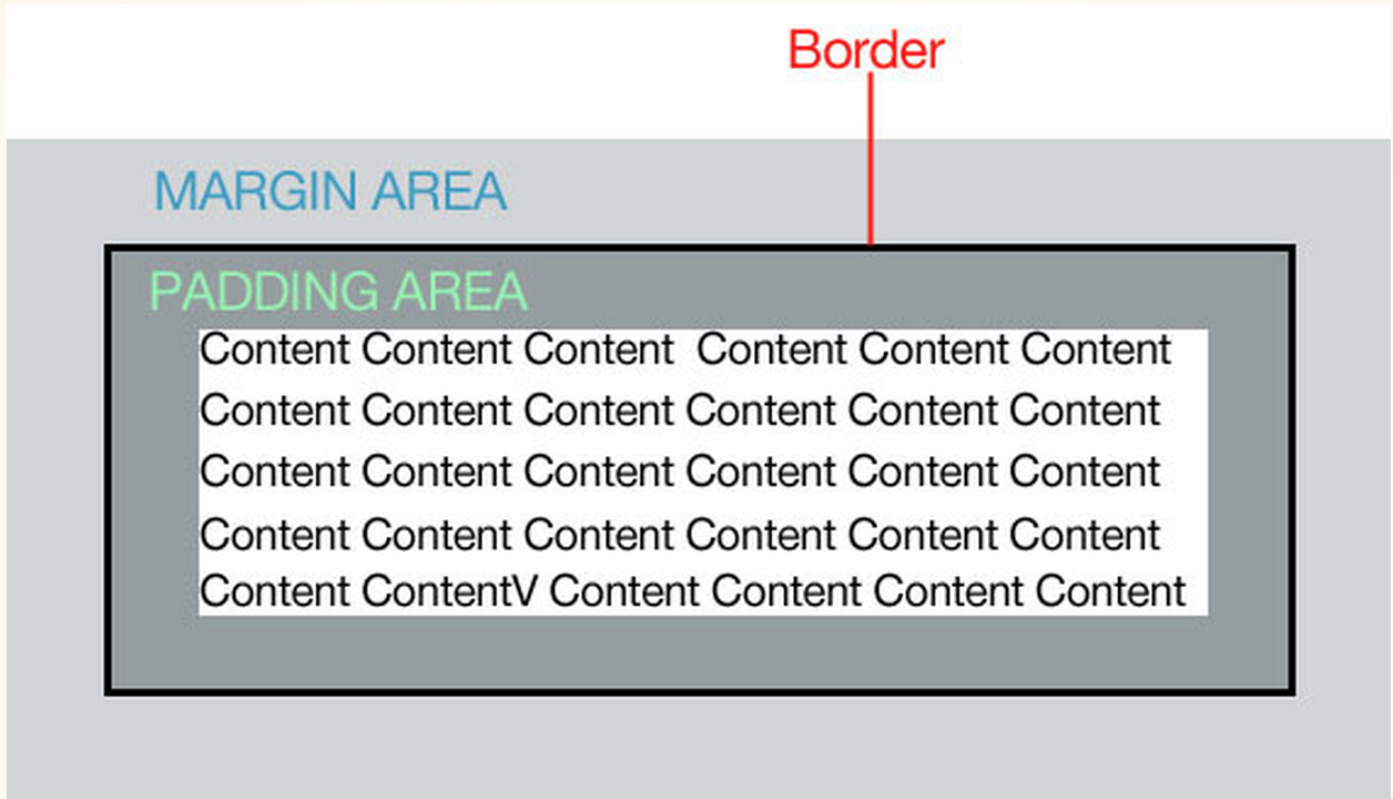
The box Model
Padding: the space in between the border and the content. Padding is added on to the total width of the box.
Margin: moves the "entire box" to the left, right, up or down.
Border: a line that surrounds the the element. Borders are added on to the total width of the box.
You can affect all 4 sides of the box individually
Padding
- padding-left: 3px;
- padding-right: 4px;
- padding-top: 5px;
- padding-bottom: 6px;
padding: 5px; - gives all 4 sides the same padding
padding: 3px 4px 5px 6px; - shorthand version
MARGINS
- margin-left:3px;
- margin-right:4px;
- margin-top:5px;
- margin-bottom:6px;
margin: 5px; - gives all 4 sides the same margins
margin: 3px 4px 5px 6px; - shorthand version
- Margins collapse!
- You can use negative margins (ex: margin-left:-20px;)
- You can only add left/right margins to inline elements- except for images.
BORDERS
- border-style (border-top-style)
- border-width (border-top-width)
- border-color (border-top-color)
- border:width, style, color;
- border-top:width, style, color;
To added rounded corners:
- border-radius:5px;
- border-top-right-radius:5px;
You can add a photo for a border:
- border-image:url(path to image), slice, border-image-repeat;
- border-image:url(kittens.jpg) 55 55 55 55, stretch;
Demo
BOX SIZING & OVERFLOW
- box-sizing: (content-box, border-box);
- width: (percentage, numerical value, auto, inherit)
- height: (percentage, numerical value, auto, inherit)
BOX SIZING
By default, overflow is set to visible which allows content to "break" outside the box when it has a specific height.
- overflow: (visible, hidden, scroll, auto, inherit)
OVERFLOW
DISPLAY & BOX SHADOW
- You can change how an element is displayed
- display: (inline, block, none)
DISPLAY
- box-shadow: (horizontal offset, vertical offset, blur distance, spread distance, color)
- box-shadow: 6px 5px 5px 6px #4444;
- will have to use vendor prefixes.
BOX SHADOW
Demo
FLOATING AND POSITIONING
THE FLOAT PROPERTY
- float: (left, right, none, inherit)
- Can be applied to any HTML element to position it on the page
- Used to create multi-column layouts
- img {float:left;} would position all elements to the left side of my page.
p{
    width: 400px;
    float: left
}

img{
    float: right;
}
The paragraph will appear on the left and the image will appear on the right.
THE FLOAT PROPERTY
- Always provide a width for floated text elements
- Floated inline elements behave as block level elements
- Margins on floated elements do not collapse
INLINE ELEMENTS
- Always provide a width
- Elements do not float higher than their original spot
BLOCK ELEMENTS
THE CLEAR PROPERTY
-
Clears floated elements and returns it to it's natural state
-
clear:(left, right, both, none, inherit)
FLOATING MULTIPLE ELEMENTS
-
containing elements will not "enclose" floated elements by default.
-
floating the containing element is one fix
-
setting the overflow:auto is another way to fix this
-
using the after selector is also a way to fix this
DEMO
USING SHAPES
- You can curve your float so it wraps around a shape
- shape-outside (none, circle, ellipse, polygon, url, margin-box, padding-box, content-box)
- DEMO
CSS Positioning
- moves elements around in the layout
- position: (static, relative, absolute, fixed)
- You can position an element on the screen by using top, right, bottom or left
CSS Positioning
- Static: the default position
- Relative: positions an element relative to the parent element.
p{
   position: relative;
   top:20px;
   left: 50px;
}- Absolute: positions an element relative to the the browser screen. The default position is the top left.
p{
   position: absolute;
   top:20px;
   left: 50px;
}
CSS Positioning
- Z-index: specifies the stack order of elements. If something goes in front of or behind an element
- By default, the z-index for elements are 0
- You can use positive or negative numbers
- In order for z-index to work, you have to use absolute or relative positioning
.blue{
   position: relative;
   top:20px;
   left: 50px;
   z-index: 5;
}

.red{
   position: relative;
   top:20px;
   left: 50px;
   z-index: 3;
}
Blue will go in front of red since it's a higher number
CSS FLEXBOX AND GRID
FLEXBOX
-
Used to layout components such as navigation, photo galleries, listings, etc..
-
Not used for overall page layout (CSS Grid)
-
make all items the same height
-
horizontal and vertical centering
-
change the order in which items are displayed
Advantages
FLEXBOX
-
Flexbox needs a container with the display set to "flex" in order to work
<div id="container">
    <div class="box box1">One</div>
    <div class="box box2">Two</div>
    <div class="box box3">Three</div>
</div>
#container{
display: flex;
}
FLEXBOX Properties
-
flex-direction: (row, column, row-reverse, column reverse)
-
flex-wrap: (nowrap, wrap, wrap-reverse)
-
flex-flow: (flex-direction, flex-wrap)
-
justify-content: (flex-start, flex-end, center, space-between, space-around)
-
align-self: (flex-start, flex-end, baseline)
-
align-content: (flex-start, flex-end, center, space-around, space-between, stretch)
CSS Grid
-
New way to layout pages
-
Not supported by all browsers (but can use a backup!)
-
turn the element into a grid container by using the display properties
-
set up columns and rows (think excel!)
-
assign each grid item to an area on the grid
Process
CSS Grid
-
Grid line: dividing lines
-
Grid cell: the box inside the grid lines
-
Grid area: rectangular area made up of one or more adjacent cells
-
Grid track: The space in between 2 grid lines (grid column or grid row)
CSS Grid
<div id="layout">
    <div id="one">three</div>
    <div id="two">two</div>
    <div id="three">three</div>
</div>
#layout{
display: grid;
}
CSS Grid
#layout{
display: grid;
grid-template-rows: 100px 400px 100px;
grid-template-columns: 200px 500px 200px;
}
-
grid-template-rows, grid-template-columns: (none, optional sizes and or names)
#layout{
display: grid;
grid-template-rows: [header-start] 100px [content-start] 400px [footer-start] 100px;
grid-template-columns: 200px 500px 200px;
}
CSS Grid
-
you can also use fractional units - fr. Take up whatever space is left.
DEMO CSS GRID
LWD CSS Layout
By shadow4611