Mobile Design
What you need to think about
- The screen size restrictions forces you to make decisions on what's truly important. It removes content fluff, unnecessary design elements, useless navigation and promotions (ad space)
- Connection speed to mobile networks can vary. To increase load time, load less heavy graphics & limit downloadable files
- Most users are multi-tasking when using a mobile device. This means all actions and content should be simplified so users can get the information they want quickly
Planning an app
Review content and goals
- Determine what are the major goals of the app. Is it to map locations, provide basic information, allow users to share photos?
- Sort through and remove any unnecessary content
- Limit the use of images
Planning an app
Prioritize based on the users behavior
The following behaviors illustrate how people are typically using their mobile device and why:
- Lookup/Find: I need an answer to something now—frequently related to my current location in the world
- Explore/Play: I have some time to kill and just want a few distractions
- Check In/Status: Something important to me keeps changing or updating and I want to stay on top of it
- Edit/Create: I need to get something done now that can’t wait

The flickr app has 4 major actions
Designing
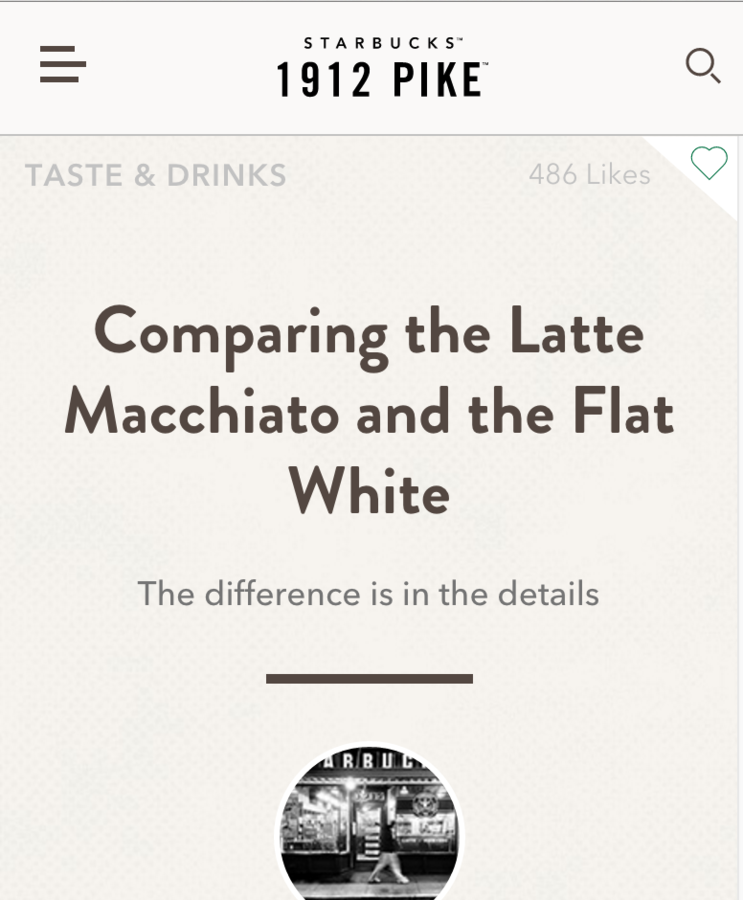
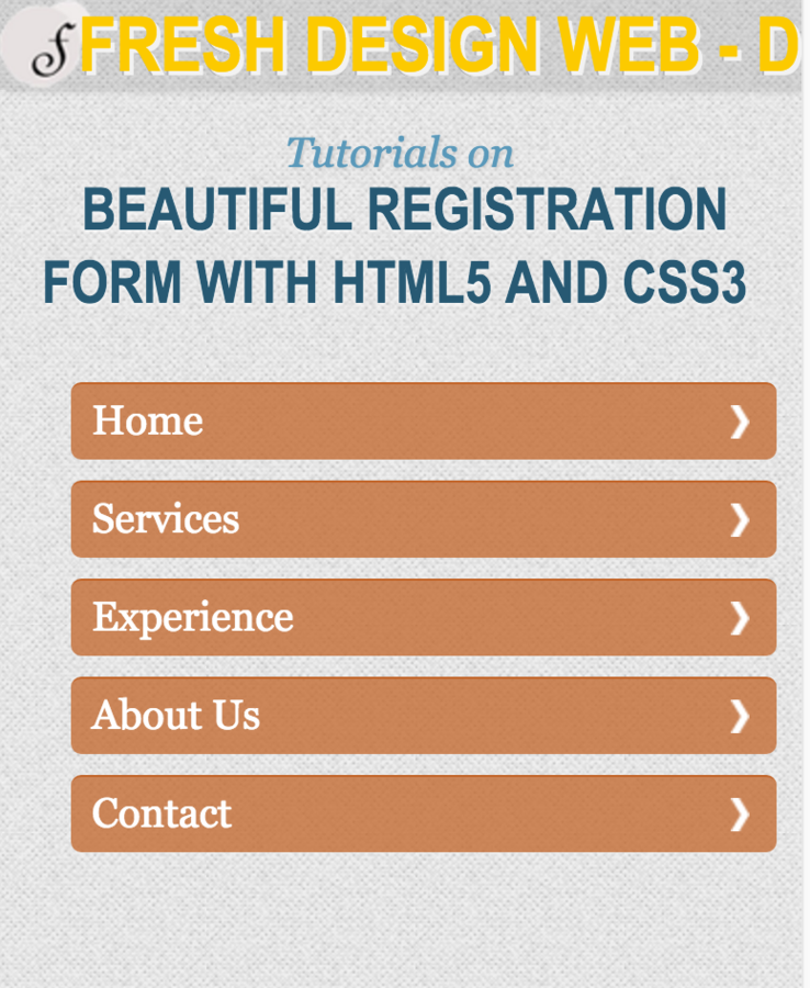
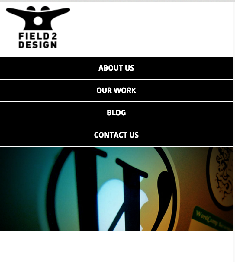
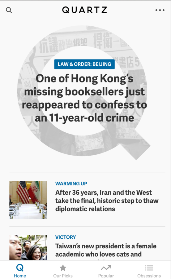
1 column works best!

Typography
- Typography should be large enough to comfortably read!
- Use more line-height (leading) then you would in a print piece
- Use only 1-2 different fonts.
- Avoid script fonts
- Use contrast
- Consistency!!
- Use em's instead of pixels to set the size of type

Responsive Design
What is it?
An approach to web design and development where websites and applications respond to the width of the screen size and the device the site or app is being viewed on
Media Queries
CSS rule that allows you to set "breakpoints" to adjust the design to the width of the screen and the type of device that the site/app is being viewed on
@media
@media (max-width: 750px) {
}
Viewport
When developing a responsive design, you also need to add a viewport meta tag to your <head> tag. This tells the browser on how to control the scaling.
<meta name="viewport" content="width=device-width, initial-scale=1.0">
Screen Sizes

Screen Sizes
iPhone 4 (portrait): 320px w x 480px h
iPhone 5 (portrait): 320px x 568
iPhone6 (portrait): 375px x 667px
Samsung Galaxy S5: 360px x 640px
LG G4: 360px x 640px
LG Nexus 5: 360px 640px
of a few popular devices
Navigation


Creating a responsive site in Dreamweaver
Templates vs Frameworks
Templates vs Frameworks
Template: Set of HTML/ CSS and functionality rules to serve as a starting point to help create an application or site. Difficult to customize
Framework: a collection of tools and/or libraries used to help create an application or site. Frameworks can have templates
Frameworks
Bootstrap and Foundation Similarities:
- Both are responsive
- Both are open source
- Both use a 12 column grid
- Both have a stylized CSS components
- Both have optional JavaScript Extensions
Frameworks
Frameworks
Foundation
- More customization when it comes to design
- Don't have to add additional classes to implement a certain style
- More unique (not over used)
- More grid system customization capabilities (including centering and collapsing columns)
- Additional built in widgets (including form validation, responsive media, off canvas menus, pricing tables and tour points)
- Additional support options offered through Zurb.
- PBS, NatGeo, Washington Post and Mozilla all use Foundation
Responsive Design
By shadow4611