Intro to CSS
CSS. What is It?
Cascading Style Sheets
Add styles to HTML pages by targeting specific tags
CSS Rule breakdown
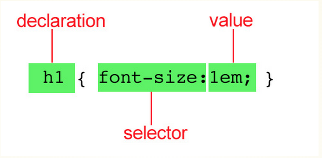
property
selector
CSS Rule Breakdown

CSS Rule Breakdown
You can also have several declarations in a single rule

How to add styles
- External style sheet - Best way to go. Separate document with .css suffix. Document is then linked to you HTML page.
- Embedded style sheet- Styles are placed in the <head> tag and only effect the tags in that HTML document
- Inline styles - Styles are placed in an HTML tag using the "style" attribute. Only effects the tag that the style was placed in.
DEMO
- add styles via embedded, linked or inline
The cascade
-
If there's conflicting styles, the browser uses the "cascade" to determine which style to show.
-
You can override all styles by assigning the !important indicator to a declaration.
the cascade
The more specific the tag is, the greater chance of the browser choosing to load that style
ex: em{color:green;}
p em {color: red;}
The browser will load the p em style because it's more specific
Demo
the cascade
The items at the top will override items below it

the cascade
If rules of identical weight conflict, which ever comes last, wins
p {color:green;}
p {color:yellow;}
p{ color:green;
color:yellow; }
grouping selectors
You can apply a style to more than one selector
p, em, li {color:red;}
Demo
the box model
-
Every element on the page is it's own "box"
-
You can apply properties such as margins, padding, backgrounds and borders
-
You can also reposition them
formatting text
properties
font-family: Arial, Helvetica, sans-serif;
font-size: size of font (ems, px or %)
font-weight: boldness (normal, bold, or value)
font-style: italics (normal, italic, oblique, inherit)
font-variant: small caps (normal, small-caps, inherit)
font: style weight variant size/line-height family
text-color: changes the font color (name or hexdex #)
Using ems
EMs are a relative measurement and is based on the
The default body size is always set to 1em (16px)
Using Ems
1em is about 16px;
You can convert from ems using a simple math equation
current px measurment/16px = em
12px/16px=.75em;
Always include the decimal for an exact conversion
Demo
Using Ems
Remember: ems are based on the inherited size of the element.
If I set an article tag to 18px (1.125em) and I wanted an H1 tag inside the article tag to be 14px, my equation would change to:
14px/18px=.77777778em
target/content=result
CHOOSING A FONT
- Design & variety (serif mixed with sans-serif)
- Websafe fonts, Google Fonts and Webfonts
- The font stack
DEMO: Using Google Fonts
More CSS Properties
- line-height: leading (number, percentage, normal, inherit)
- text-indent: indents the first line of a paragraph (#)
- text-align: aligns text (left, right, center, justify, inherit)
- text-decoration: applies a line to the text (none, underline, overline, line-through, blink)
- text-transform: caps or lowercase text (none, capitalize, lowercase, uppercase, inherit)
More CSS Properties
- letter-spacing: kerning (#)
- text-shadow: applies a shadow to text (5px, 5px, #777) (horizontal offset, vertical offset, shadow color)
- vertical align: vertical alignment of inline elements (baseline, sub, super, top, middle, bottom, #)
- visibility: hides elements (visible, hidden collapse, inherit)
Demo
SELECTORS
selector types
- element selectors: p {font-size:12px}
- grouped selectors: p, em, li {font-size:12px}
selector types
-
Contextual Selectors: Selects an element based on its context
-
Descendant Selectors: targets an element contained within another element
-
p em {color:green;} Will only target em within a p
-
selector Types
-
Child Selector: targets only the direct children
p >em{color:green} will only target an em tag if it's within the p with no other tags in between.
-
Adjacent Sibling: targets an element that comes directly after another element with the same parent
p+em{color:green} will only target an em tag if it directly comes after a </p>
Contextual Selectors
selector Types
- General Sibling: selects an element that shares a parent and occurs after in the source order. BUT it doesn't have to be directly after
- p~em:{color:green;} will target an em tag if it comes after the p (there can be tags in between)
- Does not work in IE8 or lower
Contextual Selectors
selector Types
target elements by their id values
<p id="red">Blah Blah</p>
#red{color:red;}
ID Selectors
selector Types
Works like an id selector except you can target a class
<li class="textChange">bla bla</li>
.textChange{}
Class Selectors
Demo
specificity within selectors
1. ID selectors
2. Class selectors
3. Contextual selectors
4. Individual element selectors
strong{color:red;}
h1 strong{color:green;}
The top will override what's below it
styling bullets
- list-style-type: changes the marker. By default it's a disc (disc, circle,square,decimal, lower-alpha, upper-alpha, lower-roman, upper-roman, lower-greek)
- list-style-position: changes where the bullet is placed. Default is outside of the content area (inside, outside, inherit)
-
list-style-image: allows you to add an image for a bullet (url:path to image)
Demo
CSS Colors
color values
- Name - color:red
- RGB Value - color: rgb (200, 178, 230)
- Hexdex #- color: #888f90
- HSL (new in CSS3) - color: hsl (265, 32%, 90%)ways have a name
There are several ways you can specify a color
opacity values
- color: rgba(12, 130, 20, 50%)
- color:#ffffff; opacity: .5
You can specify an opacity value of a color two different ways:
Color Inspiration
Background Images
- background-image: url(path to file);
- background repeat: (repeat, repeat-x, repeat-y, no-repeat, inherit)
- background-position: (measurement, percentage, left, center, right, top, bottom, inherit)
- background-attachment: (scroll, fixed, local, inherit)
Background Images
shorthand: shorthand (can appear in any order)
background: background-color background-image background-repeat background-attachment background-position
background:url(kittens.jpg) no-repeat left top fixed #444444;
Demo
Background Images
You can also call multiple background images. The image called first will be placed in front.
background-image: url(kittens.jpg), url(dogs.jpg);
background-position: left top, center top;
background-repeat: no-repeat, repeat-y;
Background Images
You can also use the short hand version to call multiple background images:
background: url(kittens.jpg) left top no-repeat, url (dogs.jpg) left center, repeat-y;
pseudo class selectors
- :link - applies a style to an unclicked link
- :visited - applies a style to an already clicked link
- :focus - applies a style when an element is ready for input
- :hover - applies a style when a link is hovered over with mouse
- :active - applies a style when the element is being clicked
are applied to already existing classes
Demo
pseudo element selectors
- :first-line (color, font, background, word-spacing, letter-spacing, text-decoration, vertical-alignment, text-transform, line-height)
- :first-letter (color, font, text-decoration, text-transform, vertical-align, padding, background, margin, line-height, border, float, letter-spacing, word-spacing)
- p:first-letter{color:green;}
p:first-line{font-size:18px}
are applied to already existing classes
pseudo element selectors
- :before - inserts content before the specified element
-
:after- inserts content after the specified element
p:before{
content:"Once upon a time";
font-weight:bold;
color:purple;
}
are applied to already existing classes
attribute selectors
-
element[attribute]: selects an element that has a the specified attribute
img[title]{border3px solid #555;}
element [attribute="exact value"]
CSS: input[type="text"]{border:1px solid #444;}
are applied to already existing classes
CSS Gradients, Rounded corners & Drop shadows
Gradients
CSS Gradient Tools
CSS gradients are very complex. Using a tool can help simplify the process
Rounded Corners
Use the property border-radius:
.square{
  border-radius: 25px;
  border: 2px solid #73AD21;
}
Below sets all 4 corners to a radius of 25px;
.square{
  border-top-left-radius: 15px;
  border-top-right-radius: 20px;
  border-bottom-right-radius: 25px;
  border-bottom-left-radius: 30px;
  border: 2px solid #73AD21;
}
You can also affect all 4 corners independently
Drop Shadows
Use the property box-shadow adds a drop shadow to an elements frame
box-shadow: offset-x offset-y blur color;
.square{
  border-radius: 25px;
  box-shadow: 5px 5px 2px #444;
}
You can also add additional values:
box-shadow: offset-x offset-y blur spread color;
.square{
  border-radius: 25px;
  box-shadow: 2px 2px 2px 1px rgba(0, 0, 0, 0.2);
}
Drop Shadows
You can also use numerous web tools to help generate a box shadow
TEXT Shadows
You can also add drop shadows to text
text-shadow: offset-x offset-y blur color
h1{
   text-shadow: 1px 1px 2px black;
}
Text Shadow Tools
LWD Week 5A
By shadow4611