previous student work
ANALYSING THE ANCILLARY
VIDEO No. 1
Digipack
- Strenghts
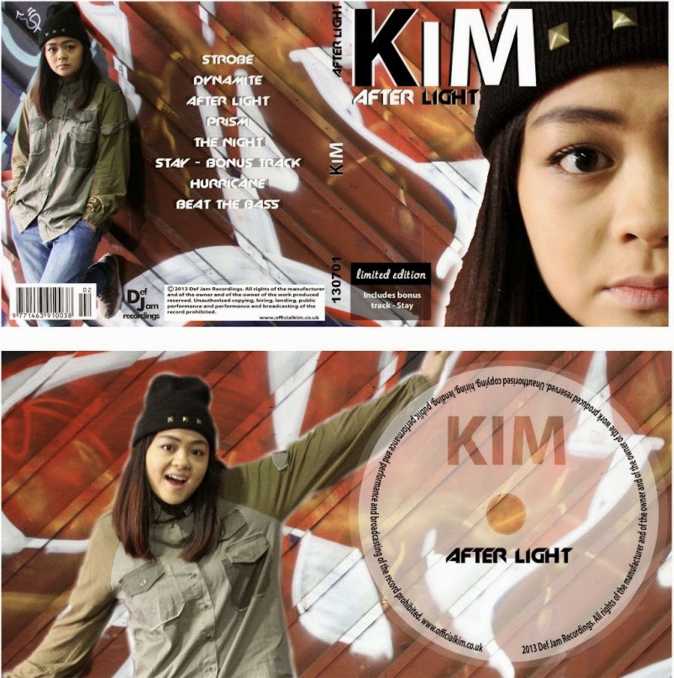
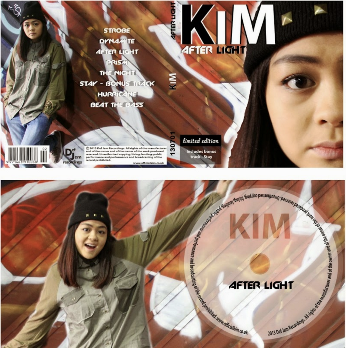
In order to create synergy this student used the same outfit for the cover as the artist wears in the most of the video. Location of the photographs is also same as the video location. Moreover, when it comes to details and promotion the cover contains a record label which the artists is signed to and a playlist of the other songs at the back of the digipack. Also, the has a barcode and copyright details printed on it which adds more professionalism to it.
DIGIPACK
- Weaknesses
It is way overloaded with with colours, different fonts and pictures. Instead of making the cd itself simple in one solid colour the student should have made the cover more simple and add more visual texture onto the cd. Another small detail to notice is the fact that in the actual video the artist does not wear the hat with this outfit.
ADVERTISEMENT - POSTER
- Strengths
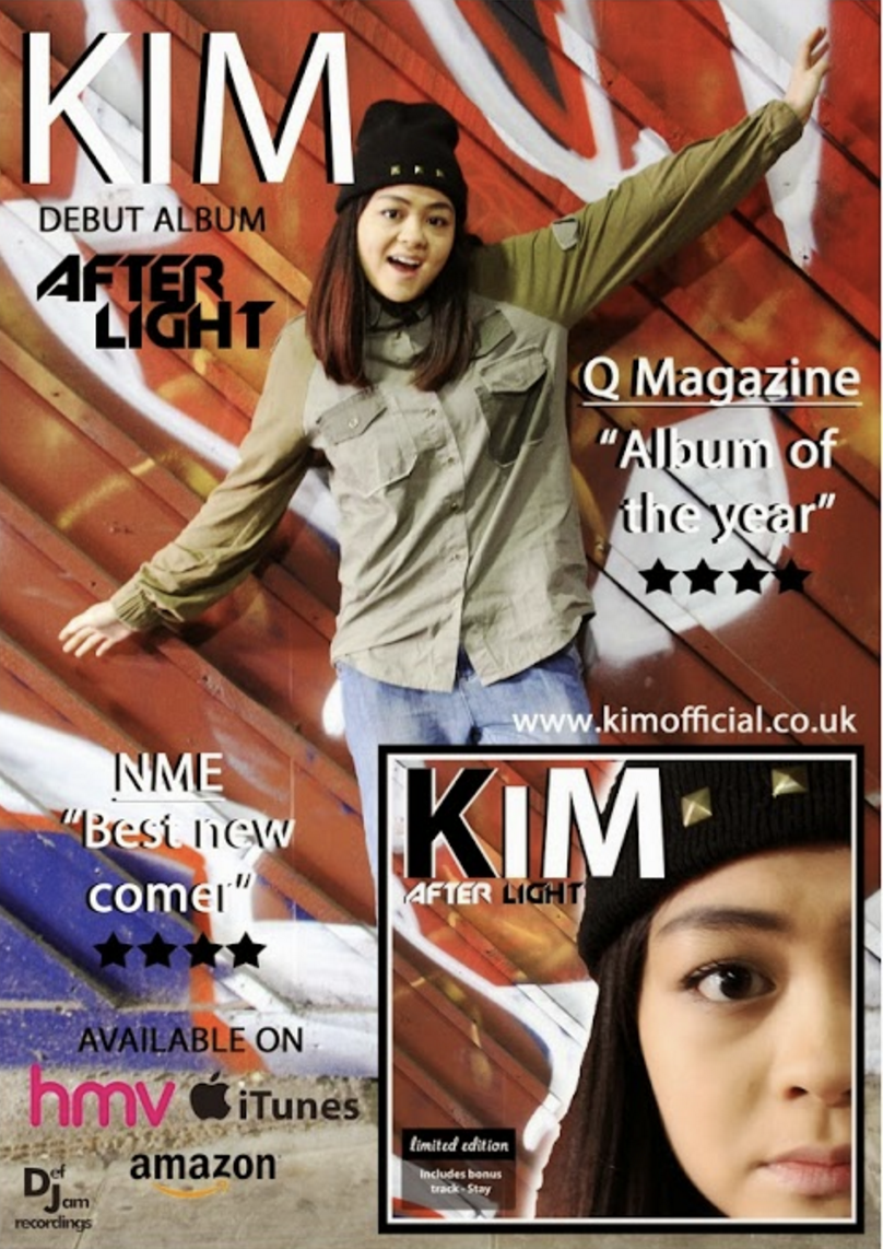
Poster contains details such as; ratings, names of places where it is possible to purchase the CD, magazine quotes and image of the digipack itself. It also has a synergy link with the video and the CD cover by using the image of an artist from the same photoshoot they used when making the digipack.
ADVERTISEMENT - POSTER
- Weaknesses
Student used different fonts when making poster and digipack (they used way too many fonts when creating of of them). Also, the poster looks too busy with all the colours and images going on, so it is hard for the audience to concentrate just on one key message of this design which is to become familiarised with the product.
VIDEO No. 2
- Strengths
Digipack
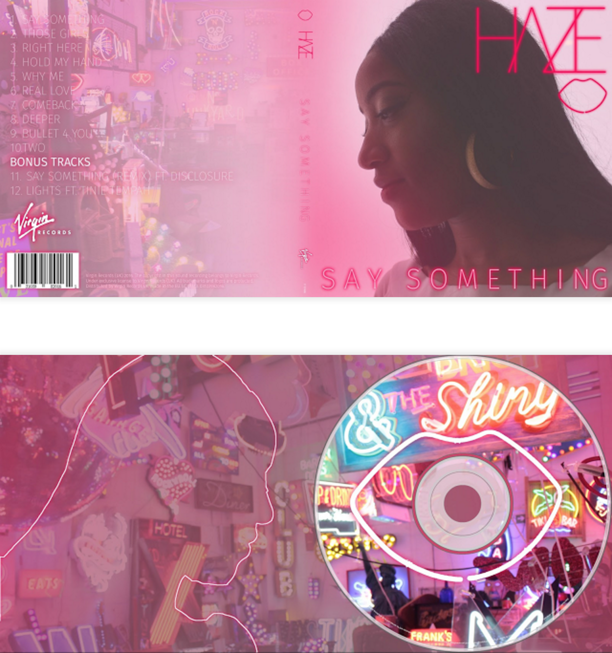
To create synergy links within this digipack design and the music video this student took the key elements shown in the video so that the audience would be capable to familiarise themselves with the product. They used pink colour scheme as it runs throughout the music video, they also included neon signs from the location where all the verses have been filmed. They also managed to experiment a bit more and created a silhouette of person (maybe attempted it to be an artist) and placed it on the back of the cover while at he front the audience is able to see a side profile of the artist herself. The CD and the cover of it contains a lip outline motif which kind of becomes as their product signature.The student also included the key elements such as; barcode, record label and list of other tracks. They only used two fonts ti make it simple and outlined the details in neon pink lines to make it more attractive to the target audience.
DIGIPACK
- Weaknesses
I couldn't notice many weaknesses, maybe just make higher opacity for the list of tracks as some of the words are hard to read.
website
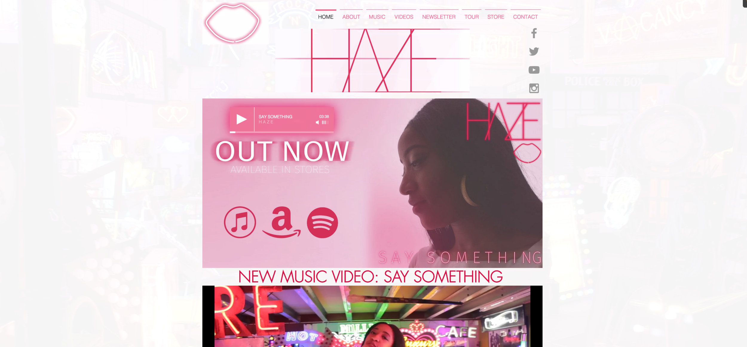
The website contains a lot of detail about the video, making of it and other additional things wchich are usually found on official band websites. They have also designed ancillary products such as hoodies, mugs and t-shirts for purchase on the website. Threre is also a nice layout design that creates synergy between the product and this website. The lip outline is also found at the top of the website pages to indicate that it's their logo.
- Strengths
website
There aren't many things that I would change about this website. However, I would add more information in the 'About' page and make up stuff about the tours in 'Tour' section of the website. Overall the design fits well and creates a great synergy with the rest of the products they have produced.
- Weaknesses
deck
By Monika L'kaitė