


Ricardo Zea
Sr. Web/Product Designer
By: Ricardo Zea - Web Designer
December 17, 2019
“New to The Web” discussion group
100% Responsive Typography System using a Modular Scale - http://tiny.cc/responsive-type
• Originally from Colombia. Don't let my "good" English deceive you.
• Moved to Dayton in 2006, married and have a 9-year old son, and two cats.
• Web designer for a ‘little while’.
• HTML+CSS Expert Mentor on Codementor.io
• Wrote two books:
- Mastering Responsive Web Design: masteringrwd.com
- Web Developer's Reference Guide: tiny.cc/web-devs-reference-guide
• Wrote for Smashing Magazine:
- An Ultimate Guide To CSS Pseudo Classes And Pseudo Elements
• I designed the Dayton Web Developers logo.
• "I don't think there are dumb questions, it's just dumb not to ask."
• Windows 😁, Mac 🤢.
100% Responsive Typography System using a Modular Scale - http://tiny.cc/responsive-type
I am a designer, not a developer, so there will be a combination of basic math and “it-feels-just-right”, not intricate explanations or convoluted formulas.
100% Responsive Typography System using a Modular Scale - http://tiny.cc/responsive-type
100% Responsive Typography System using a Modular Scale - http://tiny.cc/responsive-type
100% Responsive Typography System using a Modular Scale - http://tiny.cc/responsive-type
Create a pleasant and responsive UX reading experience.
100% Responsive Typography System using a Modular Scale - http://tiny.cc/responsive-type
100% Responsive Typography System using a Modular Scale - http://tiny.cc/responsive-type
For best results, use an MS with a smooth curve.
100% Responsive Typography System using a Modular Scale - http://tiny.cc/responsive-type
Notice the 1.5 Ratio. Not a smooth curve.
100% Responsive Typography System using a Modular Scale - http://tiny.cc/responsive-type
font-size: calc(12px + 1vw);
.main-ctnr {
  width: 100%; /* For small screens */
  max-width: 1140px; /* For large screens */
  margin: auto; /* Center the container in the viewport */
}
.35vw
100% Responsive Typography System using a Modular Scale - http://tiny.cc/responsive-type
😒
100% Responsive Typography System using a Modular Scale - http://tiny.cc/responsive-type
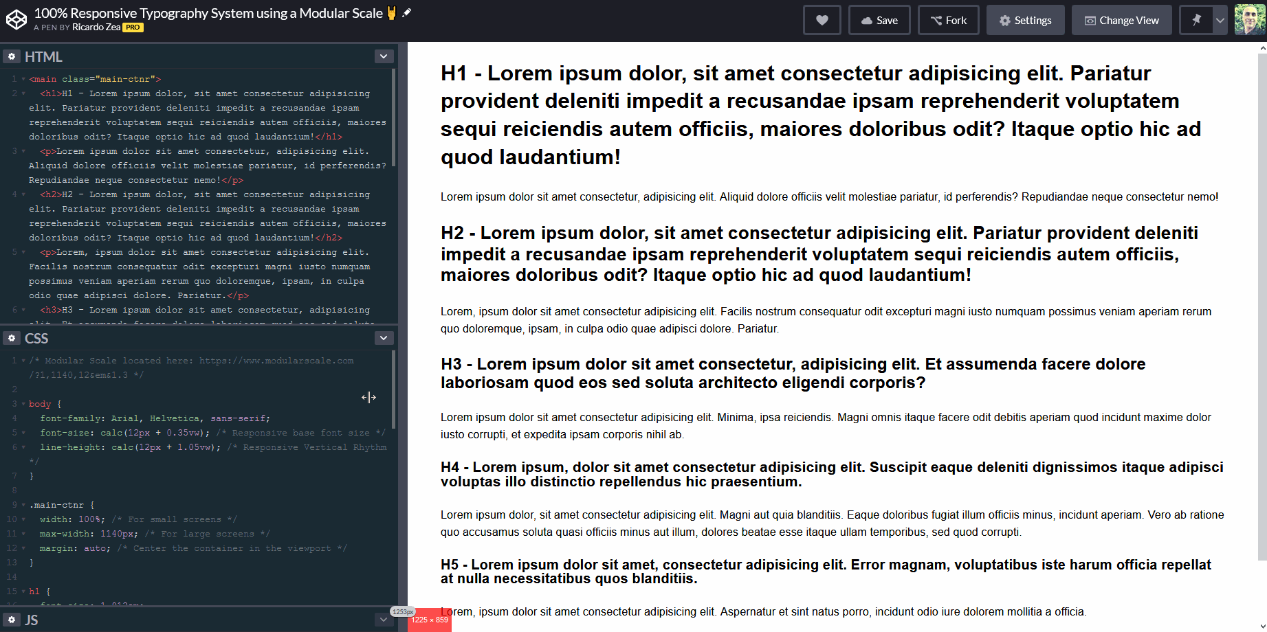
Define font sizes for all six headings using the Modular Scale:
h1 { font-size: 1.912em; }
h2 { font-size: 1.616em; }
h3 { font-size: 1.471em; }
h4 { font-size: 1.3em; }
h5 { font-size: 1.243em; }
h6 { font-size: 1.132em; }
Modular Scale link:
100% Responsive Typography System using a Modular Scale - http://tiny.cc/responsive-type
Thank you! - Gracias!
100% Responsive Typography System using a Modular Scale - http://tiny.cc/responsive-type
100% Responsive Typography System using a Modular Scale - http://tiny.cc/responsive-type
By: Ricardo Zea - Web Designer
December 17, 2019
“New to The Web” discussion group
By Ricardo Zea
Using a modular scale, some basic CSS and a bit of "eye balling", I show you how to create a responsive typography system. Slides done for the New to The Web discussion group in Dayton, OH.