The box model, layout and styling images
Week 9
the box model
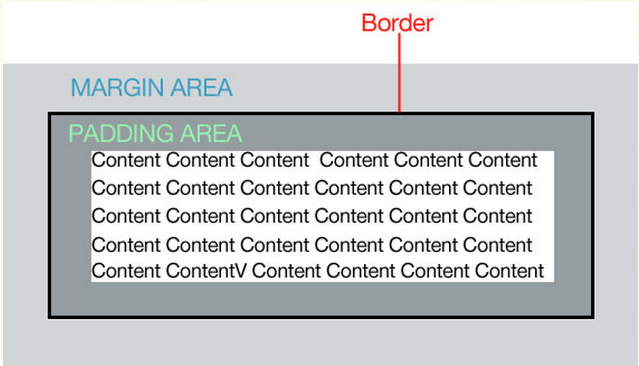
the box model
- padding- the space in between the border and the content. Padding is added on to the total width of the box.
- margin- moves the "entire box" to the left, right, up or down
- border- a line that surrounds the the element. Borders are added on to the total width of the box
You can effect all four sizes of the box
padding
- padding-left: 3px;
- padding-right: 4px;
- padding-top: 5px;
- padding-bottom: 6px;
- padding: 5px;
- padding: 3px 4px 5px 6px;
Margins
- margin-left:3px;
- margin-right:4px;
- margin-top:5px;
- margin-bottom:6px;
- margin:5px;
- margin:3px 4px 5px 6px;
Margins
- Margins collapse!
- You can you negative margins (ex: margin-left:-20px;)
- You can only add left/right margins to inline elements- except for images.
Borders
- border-style (border-top-style)
- border-width (border-top-width)
- border-color (border-top-color)
- border: width, style, color;
- border-top: width, style, color;
Borders
To add rounded corners:
- border-radius:5px;
- border-top-right-radius:5px;
-
note: not supported in ie 8 or below
Borders
You can add a photo for a border:
- border-image:url(path to image), slice, border-image-repeat;
- border-image:url(kittens.jpg) 55 55 55 55, stretch;
Box sizing
- box-sizing: (content-box, border-box);
- width: (percentage, numerical value, auto, inherit)
- height: (percentage, numerical value, auto, inherit)
Overflow
By default, overflow is set to visible which allows content to "break" outside the box when it has a specific height.
- overflow: (visible, hidden, scroll, auto, inherit)
Display
You can change how an element is displayed
- display: (inline, block, none)
box shadow
- box-shadow: (horizontal offset, vertical offset, blur distance, spread distance, color)
box-shadow: 6px 5px 5px 6px #4444;
will have to use vendor prefixes.
css positioning and layout
the float property
- float: (left, right, none, inherit)
- Can be applied to any HTML element to position it on the page
- Used to create multi-column layouts
- img {float:left;} would position all elements to the left side of my page.
the float property
inline elements
- Always provide a width for floated text elements
- Floated inline elements behave as block level elements
- Margins on floated elements do not collapse
the float property
block level elements
- Always provide a width
- elements do not float higher than their original spot
the CLEAR PROPERTY
Clears floated elements and returns it to it's natural state
clear:(left, right, both, none, inherit)
floating multiple properties
- containing elements will not "enclose" floated elements by default.
- floating the containing element is one fix
- setting the overflow: auto is another way to fix this
Using floats to create columns
Demo
Using CSS positioning
position: (static, relative, absolute, fixed, inherit)
You also have to specify where you what the element moved.
top, right, bottom, left
top: 10px;
Using CSS positioning
- static: default. Normal positioning within the document.
- relative: moves an element relative to it's original positioning.
- absolute: elements are removed from the document flow and are positioned in respect to the browser window or containing element
- fixed: element stays "fixed" in one position as users scroll
Using CSS positioning
z-index: (number, auto, inherit)
- moves items up or down on the "z-axis"
- by default items are stacked at 1
CSS positioning
demo
page layouts
types of page layouts
- fixed: stay at a specific pixel width
- fluid: resize according to the size of the browser
- elastic: resize based on the proportional value of the text
- hybrid: combine fixed and scalable layouts
fixed layout
- easiest to accomplish as a beginner
- secures the design won't break
- does not adapt to screen size
- all widths and height will be in px
fixed layout demo
fluid layouts
- more advanced way of page layout
- site design "adapts" to the size of the browser window
- elements may "break" as site is scaled down
- more math
- all widths and heights should be in %
fluid layout demo
elastic layouts
- less popular than fixed and fluid
- allows flexibility in text size
- images and video don't scale
- hard to control the site width
- not cross device friendly
hybrid layouts
- use both % and px to create widths
- can be used to create a "responsive" site
Grid systems
using faux columns
styling images
styling images
You can control the width and height of an image via CSS
img {
width: 100px;
height: 200px;
}
img.large{
width: 100%;
height: 200%;
}
aligning images
You can also align images using the float property or by using margin: 0px auto to center them
img.left {
float:left
}
img.center{
display: block;
margin: 0px auto;
}
background images
- background-image: url ("images/backgroundimage.jpg");
- background-repeat: (repeat-x, repeat-y, or repeat)
- background-attachement: (fixed or scroll);
- background position: (left, right, top, bottom)
You can set images as background and control if they repeat and their position
background images
- background: #444 url ("images/backgroundimage.jpg") no-repeat top left;
You can also use the shorthand version
Order:
1. Color
2. Image URL
3. Repeat
4. Attachment
5. Position
background images
You can set an image as a background and repeat it as a pattern.
body {
background: url (images/background.jpg) no-repeat;
}
body {
background: url (images/background.jpg) repeat-y;
}
background images
You can also call multiple background images. The image called first will be placed infront.
background-image: url(kittens.jpg), url(dogs.jpg);
background-position: left top, center top;
background-repeat: no-repeat, repeat-y;
Sprites (image rollovers)
demo
CSS Gradients
CSS Gradients
New to CSS3, you can create radial and linear gradients
background-image: linear-gradient (180deg, yellow, green)
background-image:radial-gradient (center contain yellow green)
CSS Gradients
Gradients can be difficult to understand and create, but there are tools out there that will help you generate them:
http://www.colorzilla.com/gradient-editor/
http://www.cssbuttongenerator.com/
PSEUDO CLASS SELECTORS
PSEUDO CLASS SELECTORS
Are applied to already existing classes
- :link - applies a style to an unclicked link
- :visited - applies a style to an already clicked link
- :focus - applies a style when an element is ready for input
- :hover - applies a style when a link is hovered over with mouse
- :active - applies a style when the element is being clicked
PSEUDO ELEMENT SELECTORS
Are applied to already existing classes
- :first-line (color, font, background, word-spacing, letter-spacing, text-decoration, vertical-alignment, text-transform, line-height)
- :first-letter (color, font, text-decoration, text-transform, vertical-align, padding, background, margin, line-height, border, float, letter-spacing, word-spacing)
PSEUDO ELEMENT SELECTORS
- p:first-letter{color:green;}
- p:first-line{font-size:18px}
PSEUDO ELEMENT SELECTORS
- :before - inserts content before the specified element
- :after- inserts content after the specified element
- note: the above does not work in IE7 and below
p:before{
content:"Once upon a time";
font-weight:bold;
color:purple;
}
ATTRIBUTE SELECTORS
- element[attribute]: selects an element that has a the specified attribute
img[title]{border3px solid #555;}
ATTRIBUTE SELECTORS
- element [attribute="exact value"]
input[type="text"]{border:1px solid #444;}
img[title="kittens"]
Box Model/layout/styling images
By shadow4611